Nearly 100 entries and not a single infinite regression. Sigh.
Uni Watch is referring, of course, to the incredibly irksome problem that has plagued the Miami Dolphins' uniforms since the team's inception. To wit: The leaping dolphin shown on the team's logo is wearing a helmet with an "M," which is wrong, wrong, wrong! As everyone knows, the dolphin should be wearing a helmet with a dolphin wearing a helmet with a dolphin wearing a helmet with a dolphin, and so on. This is known as an infinite regression. In addition to being super-cool, it would also provide a competitive advantage, sending the Dolphins' opponents into hypnotic trances or convulsive seizures. Why? Here, see for yourself (but don't blame Uni Watch if you lapse into a trance or lurch into spasms).
So when we recently put out the call for Uni Watch readers to redesign the Dolphins, it seemed reasonable to assume that at least a few people would find a way to solve this longstanding problem by incorporating an infinite regression into their design concepts. Incredibly, though, not a single reader did so. Come on, people!
In fact, the primary takeaway from the reader-submitted Dolphins redesigns is that if it ain't broke (lack of infinite regressions notwithstanding), don't fix it. Many of the submissions made only minor changes to the team's uniform, and only a few ventured outside of the club's long-established color palette of aqua and orange. Not that the Dolphins' colors necessarily need to be changed, of course, but these design competitions usually lead to more submissions that go way outside the box. Not so much this time, though.
Still, there were plenty of interesting concepts -- or at least plenty of interesting uni components within some of the concepts. Here are the ones that stood out here at Uni Watch HQ (for all of the images that follow, you can click on the design to see a larger version):
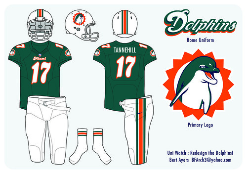
1. Most Interesting Logo: Bert Ayers
Just about every reader-submitted logo design showed a dolphin in profile. Nothing wrong with that, but Ayers' approach, showing a dolphin facing the viewer, feels more friendly and dynamic. The dolphin's white belly combines with the white helmet shell to create a helmet design that's probably a bit too white, but the logo itself is still one of the nicest reader-submitted elements from this contest. Well done. (For those who want to see more of Ayers' designs, here are his road and alternate uni concepts.)
• • •
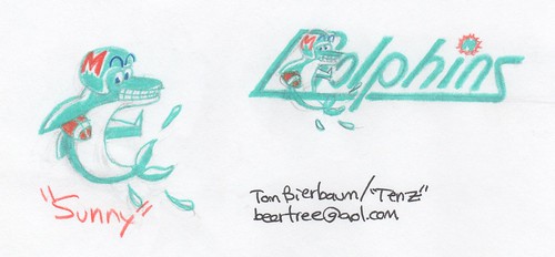
2. Best Mascot Character: Tom Bierbaum
Mascot characters nowadays are almost always fierce and intimidating, but once upon a time they were playful and fun. Bierbaum's "Sunny" character captures the essence of that bygone era perfectly (plus we get to see an animal executing a stiff-arm even though it doesn't have arms, which is a pretty neat trick). As a bonus, if you look at Bierbaum's home and road uni concepts, you'll see he's also redesigned the Raiders and moved the Jags to L.A.! Great stuff.
• • •
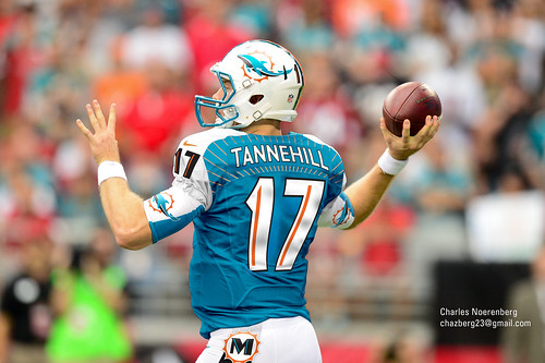
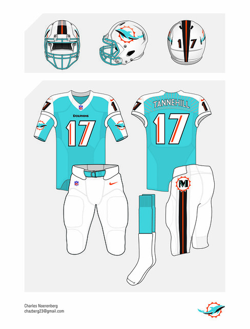
3. Best Design That We'd All Freak Out Over If Nike Did It: Charles Noerenberg
"I wanted to do an art deco design, sort of like the Marlins tried to before they executed it so horribly," says Noerenberg. "I'm not sure if you're going to like it, but I tried to keep it in good taste while still pushing the envelope -- sort of that 'controlled chaos' cliché." Not a bad explanation. If the team really came out with this design, fans would probably stage a revolt, but you have to admit it looks fun on the computer screen, right? Here are Noerenberg's road and alternate concepts. ("I went a little more crazy on the alternate," he admits.)
• • •
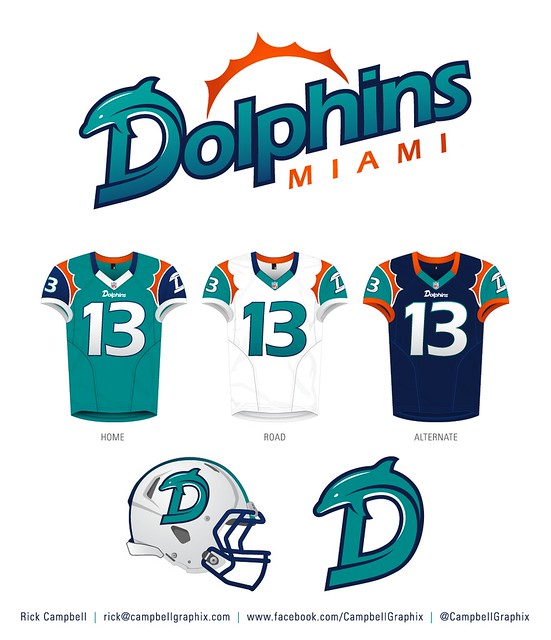
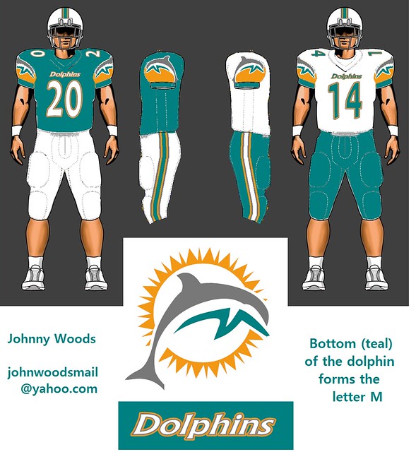
4. Best Shoulder/Sleeve Designs: Rick Campbell and Johnny Woods
The Dolphins' two primary visual motifs -- the dolphin and the sunburst -- both offer intriguing design possibilities for the shoulder and sleeve region of the jersey, as seen in these submissions from Campbell and Woods. Although neither of these designs holds together as a full uniform set, the shoulder concepts are definitely worth singling out.
• • •
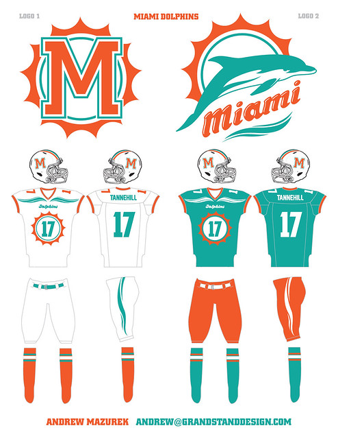
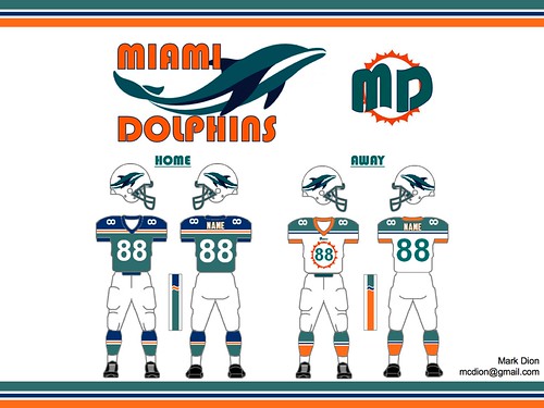
5. Best Uni Number Format: Andrew Mazurek and Mark Dion
As Mazurek and Dion recognized, the Dolphins' sunburst element also provides some interesting opportunities for the front-jersey uniform numbers. Using this bull's eye-style format would run afoul of current NFL uni regulations, which require larger numerals, but that rule has been waived before, as in the case of the Packers' throwbacks, so why not here? Again, these two uniform sets aren't strong enough to stand on their own, but the number concept is a keeper.
• • •
Honorable Mention: Brendan Jang really misses the Hartford Whalers' old logo and "Pucky the Whale" mascot, so he came up with a Dolphins concept that pays tribute to the Whalers. ... Remember the Redskins' old spear-themed helmet design? There's a strong echo of that design in the helmet submission from Chris Hine, whose stylized dolphin is very spear-like. ... NBA logos almost always include a basketball, but you don't often see a ball-centric NFL logo like the one Dan Kennedy designed. The problem with it (and with lots of other fin-themed submissions) is that we tend to associate dorsal fins with sharks, not dolphins. ... Several readers included aquatic-themed elements in their uniform concepts, but Vinny Bove was the only one who had the guts to push this approach all the way, putting wavy, watery stripes on the helmet, pants, socks and base-layer sleeves. This would never fly in the real world (for one thing, comparisons to the Islanders' infamous "fisherman" uni would be immediate and unrelenting), but adding a bit of aquatic imagery to the Dolphins' uni would be a nice touch.
Want to see more? You can view all the designs that were submitted here.
Paul Lukas suggests that all fans of infinite regressions immediately check out the very awesome Infinite Cat Project. If you liked this column, you'll probably like his daily Uni Watch web site, plus you can follow him on Twitter and Facebook. Want to learn about his Uni Watch Membership Program, be added to his mailing list so you'll always know when a new column has been posted, or just ask him a question? Contact him here.

