Is an expansion franchise coming to Las Vegas? Quite possibly! But what would a team in Vegas be called, and what would it look like?
We recently challenged our readers to answer those questions, and the results were really interesting. Sure, some of the same themes came up repeatedly (lots of people chose to name their teams the Aces, the Jokers or the Blackjacks, for example), and anything involving Vegas lends itself to a certain kitsch factor, but many of the designs we received broke past the clichés and staked out good aesthetic turf.
With that in mind, here are five of the best designs, along with some honorable mentions (in each case, you can click on the image to see a larger version of it):
1. Best overall presentation: Jim Brewster
We've done a lot of these Uni Watch design contests over the years, but until now, nobody had ever come up with a video submission. Jim Brewster's concept for the Las Vegas Aces shows how effective the video format can be when showcasing a new team brand, but the success of his design isn't all due to video razzle-dazzle. He has a good concept that leverages the word "aces" in two different ways (from a gambling perspective and an aviation perspective), and he's come up with a really fun mascot called the "Hockey Hound." Well done.
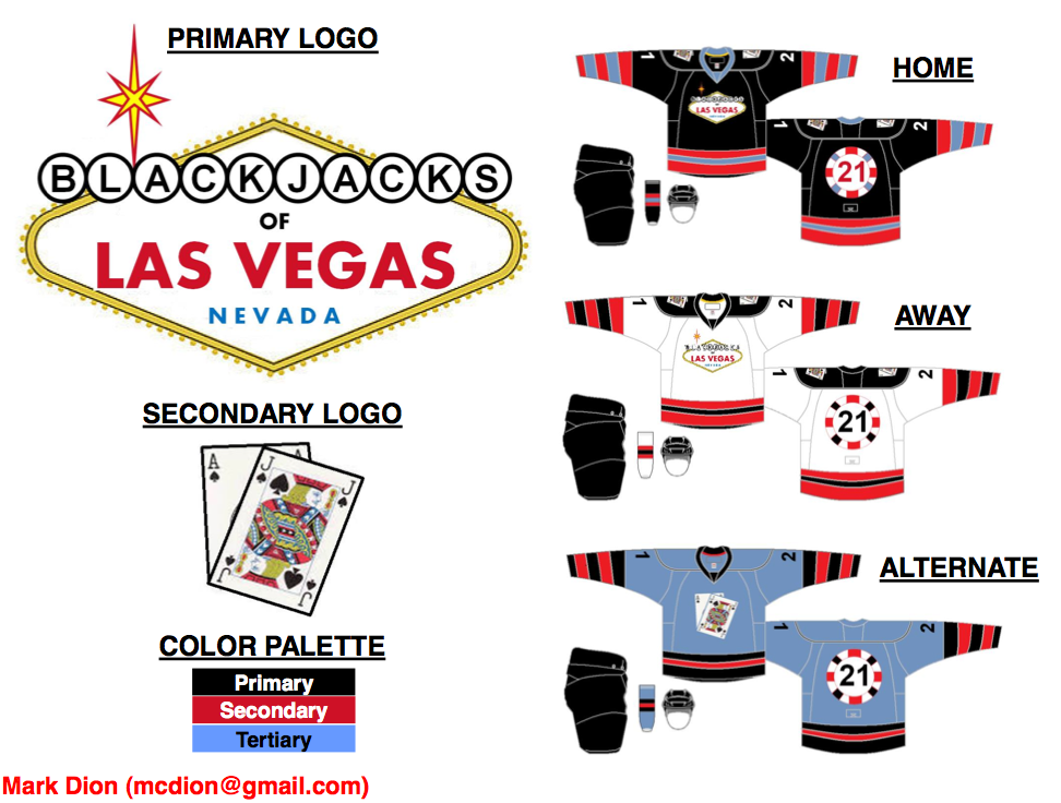
2. Best mixing and matching of Las Vegas iconography: Mark Dion
Many readers drew upon classic Vegas imagery such as playing cards, casino chips and the city's famous welcome sign. But Mark Dion managed to combine all of these elements, without any sense of overkill, in his Blackjacks concept. The casino chip motif for the uni numbers on the back of the jerseys is a particularly nice touch. Good job all around.
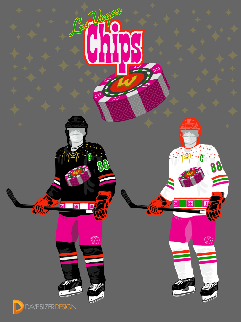
3. Best chest logo overshadowed by garish colors: Dave Sizer
Dave Sizer's design for the Las Vegas Chips has a color scheme that's way too loud to take seriously. But that chest logo -- it's a winner! Change up some of the colors here and you'd have a major contender.
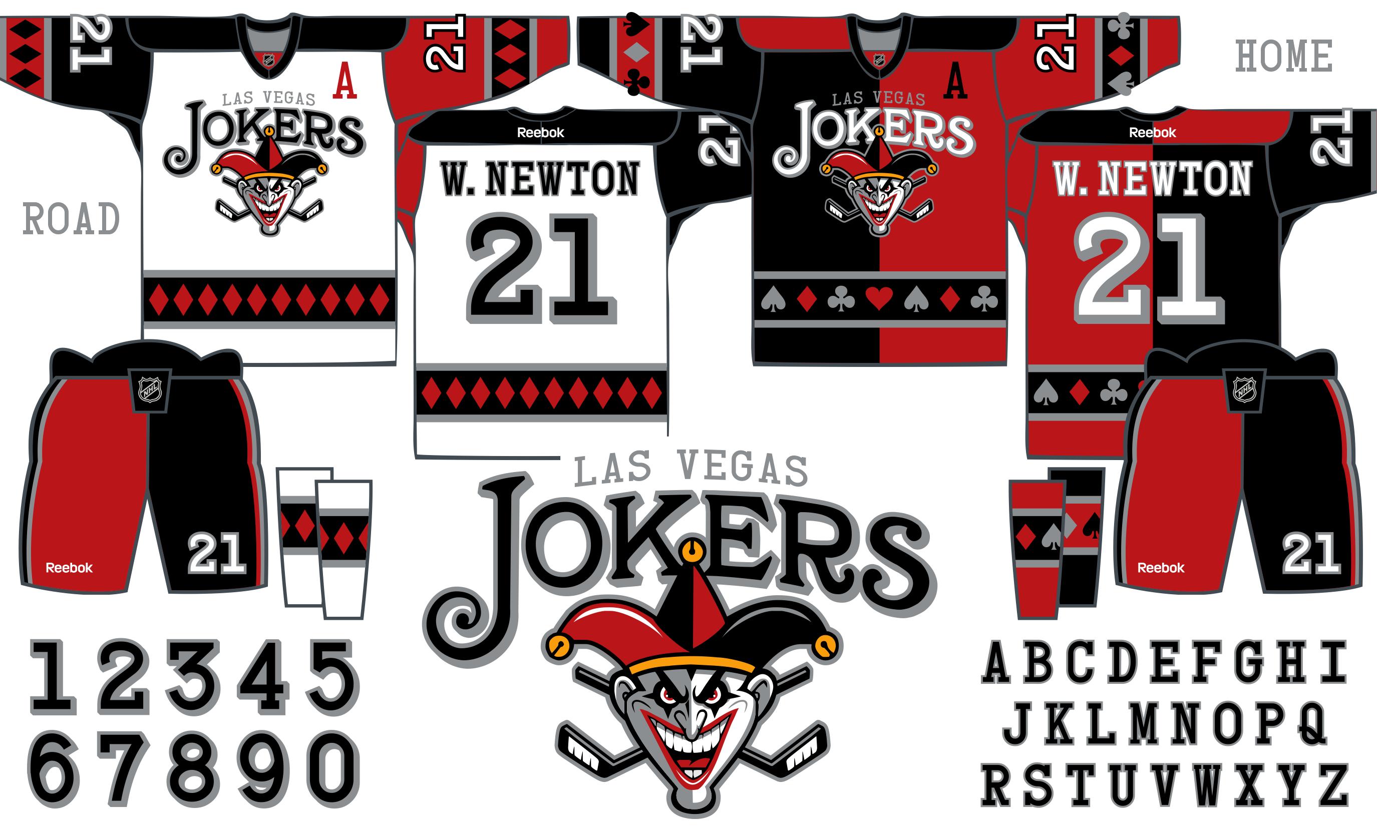
4. Best Jokers: Ben Peters
Lots of readers chose Jokers as their team name, but Ben Peters did the best job of delivering on the promise of that moniker. He designed uniforms with mismatched colors down the jerseys, pants and socks, like a classic court jester's outfit. Realistically, this would probably look brutal on the ice, but sometimes you have to dare to be bold innovative edgy awful. Just one revision needs to be made here: Scrap the team name on the jerseys and just stick with the joker's head.
5. Best design that's actually several designs: Tom Bierbaum
Whenever we run one of these contests, it's almost a foregone conclusion that one of the best submissions will come from Tom Bierbaum. It's nice that he draws his concepts freehand, not on a computer, but the best part is that he always includes new uniforms for the opposing teams shown in his renderings. If you check out the home uni for his Las Vegas Silver Six, for example (see above), the opposing team is the fictitious Indianapolis Checkers, whose checkered chest emblem spells out "Checkers" -- awesome! And his road uni for the Silver Six shows an excellent concept for a hypothetical Seattle team called the Totems. Good work on the Silver Six logos, too.
Honorable mentions: Jim Nedelka came up with a great team name -- the Las Vegas Rat Pack -- although his uniform concepts feel too much like novelty designs. ... Jeff Provo designed a very effective chest logo, but his color scheme feels a bit off, and "Cards" doesn't seem like a team name that people are going to rally around. ... Brent Hatfield's design for the Las Vegas Atom Bombs kind of skirts the edges of questionable taste (yes, Nevada was once a nuclear testing ground, but atomic weapons are no laughing matter), but his "Radiation Area" sleeve patch is a pretty inspired touch. ... Rob Ullman was ahead of the curve for this contest because his design for the Las Vegas Black Jacks was already featured on the cover of Vegas Seven magazine back in January. You can read more about that design and see some of Ullman's developmental sketches here. ... Several people suggested the team name Black Knights (or in some cases just Knights), apparently because potential team owner William Foley has said he favors that name. The best of these submissions came from Brent Suereth, who earned bonus points for his nifty little inaugural-season patch.
Want to see more? You can check out all of the designs we received here.
Paul Lukas can't believe nobody came up with Las Vegas Craps as a team name. If you liked this column, you'll probably like his Uni Watch blog, plus you can follow him on Twitter and Facebook. Want to learn about his Uni Watch membership program, be added to his mailing list so you'll always know when a new column has been posted or just ask him a question? Contact him here.


